Inspiration
Entering into Christmas Season with an experimental project for the French pâtisserie chain; Paul Lafayet.
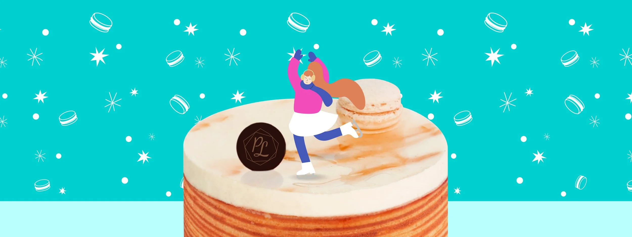
The Design is inspired by the Advent Calendar - with a twist, and ice skating. Using the Brand main color – Turquoise, and an elegant blend of Blue and Magenta, I created perky and curvy characters with a similar style to some of the brand’s previous illustrations. The packaging is made to resemble an ice-skating rink with playful characters enjoying the joyful winter season, waiting for the festivities to arrive while having some delicious macarons.

Versatile Packaging
To make things more interesting, this could be slightly modified to be stackable. By adding small hooks on the edge of the circle in the middle, it could be turned into a fun collection with different color variation of the box, and still having the same functionality.
I didn’t want the packaging to be restrained by the Advent concept of 24 days, so instead I’m only using the concept of the small shelves to store and protect the macarons. The center of the box has a perfectly crafted low-depth space to place the exclusive Snow Globe that comes with the purchase of this special edition set – they are not simply buying desserts, they are getting a unique centerpiece that comes with a warmth Christmas card inside the Gift Box. The Snow Globe is made of paper die cuts on the inside which makes it lightweight and easy to carry around.


This Packaging is sophisticated and versatile, is made to be kept and reused. Its major perk is that it allows customers to hold Paul Lafayet’s products in the center – macarons, cakes, tea tins, while having a casual gathering or a special occasion.
